Posts

Showing posts from May, 2022

The Zine Library

Image
During the Bring the Paint Festival , alongside the Badge Making Workshop was a small Zine exhibition. The Zines were separated into a groups: music, events, mental health and mixed topics. I looked trough all of them which was very inspirational experience, the range of colours, techniques and Zine sizes was impressive. Some of them were hand written, or made in collage technique, other looked professional, depends of the target group, their age and topic. A common factor was that the Zines only had a few pages and were creatively design to attract attention or highlight the magazine topic. I think, my Acid Drinkers Zine would fits there really well. This Zine cover definitely stands out from all the colourful and bright covers. The light silver font colour on the white background makes it very interesting.  I also like the sentence "Art is the thing that nobody asked you to do".  I like the choice of colours used on this Vague Zine cover. The main article is about Donald Tr...

Punk's not Dead stickers

Image
 To create the stickers I bought the adhesive matt paper on Amazon and I chose the paper that would be compatible with my inkjet printer as I wanted to print stickers at home. That was very simple process and results are amazing. Using Procreate to create the stickers let me print them without the background and with a very good quality.   During the Bring the Paint Festival, when we walked around Leicester looking for new graffities, I've been naughty and I placed my stickers around the local environment. The feeling was incredible good, excitement mixed up with adrenaline and pride as my work joined to others work and would seen by others.   Later on we went to The Mill for the graffiti workshop and I wouldn't be myself if I would not try spray painting. As you can see on the video I was still in my punky- naughty mood. The whole process of creation was very interesting and from the very beginning, I took into account the fact that I am creating stickers. That was ...

Badges making workshop

Image
This year, Bring The Paint Festival started on Monday 23rd of May through to Sunday 29th May. It was a great opportunity to see graffiti artists during the work, have a conversation with them or took part in the workshops. The Badge Making Workshop seems to be created special for me on the perfect time and in the perfect place. I read on the website that the safety pin badges would be made by using the collage techniques which was the best opportunity to use my own designs.    The workshop was at the LCB Depot and was very busy . There was a table set with stickers, colourful pictures, magazines and Posca pen for creating designs. I asked politely if I could use my own design and the staff member cut out my design to the size of the template.    This is the badges making machine. On the first step I put the silver badges top in the machine, then my own design and at the end I covered my it with the transparent plastic foil. By pushing down the black handle I pressed ...

portfolio design and feedback

Image
 Today I looked at Fadela's project , the theme that she used is Ultimate Black and the title of her collection is  "Black heart". Fadela design  swimming costumes for young women, the main colours are black and gold. The inspiration for her project was Christian Dior, Coco Chanel and the symbol of the black heart.  For the 3D project, Fadela will sew the swimming costume using lycra (spandex). The swimming costumes are elegant with the gold jewellery. Fadela will present the pictures of her project on her website gallery by using Flip book. Fadela's project is interesting and very creative. Her swimming costumes are very elegant and stylish, looks more like evening dresses because of the colour, fabric that she would use and the gold jewellery. I like the fact that Fadela interpreted differently the idea of designing costumes and they are not just common swimming costumes.   Below is a screenshot of Fadela's feedback about my project

Punk's not dead - the stickers part 2

Image
 This is one of my pictures that I created ages ago, however is still up-to-date. The text is in polish and says "stop for fascism!" I drew a shark being kicked with heavy boot which is symbol of punk subculture, same as the stripy trousers. Shark as a strong and aggressive predator is perfect as a symbol what is scared and attacks without warning.  I changed the design a little bit by adding a text in English with a strong and heavy font, which I chose to emphasize even more the strength of that message. The letter "Z" on the shark's fin is a symbol of Russian invasion used recently on Russian tanks and airplanes. Punks were always involved and interested about situation on the World and in their own country. If they do not accept or do not agree with something they talk about this in songs or posters or text sprayed on the wall.  This is my sticker , my message which I will proudly stick around the city

Punk's not dead - the stickers

Image
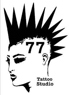
 During the online lesson I created 9 circles with something related to my project. It was a perfect development exercise and I had opportunity to created 9 stickers for my project and receive feedback from Sam.  The aim of the exercise was to include picture and text. All my stickers are strongly related to the punk subculture and I enjoyed creating them because I was able to use some of my my old drawings. For example this one with the shark where even the text is written in polish.    I added two more design which is the "77 Tattoo studio" logo and red symbol of anarchy with "no Future" text on it. I like how those three colours: red, black and white works together, makes the picture more interesting and powerful. On the last step I repeated my favourite design to fill up the page and I changed the background colour to white. Now I have perfect A4 size page ready to print.  I kept forgetting taking screenshots during drawing, luckily there is option of a time...

77 Tattoo Studio - LOGO

Image
On my post "Punk's not Dead"- first ideas I briefly explained how I created the logo for 77 Tattoo Studio. I drew the punk girl head and I've tried different fonts.    I wrote the name of the studio on the head then I placed the text next to the head and second options looks better for me. However the font wasn't  perfect, I wanted to use something simple by contrast to the detailed picture of the girl. When I finally found simple, bold and clear  font, I decided to change something else and add some colour to the logo. I changed the lip colour for the bright red and I drew a small white line on them to add some comic "glossy" effect.  I repeated  the red colour on number 77 to define importance of year 1977 for Punk subculture, when everything has started.  During the tutorial meeting with Sam we discussed progress in my main project and he suggested to add frame to the logo. It was perfect idea and the logo looks complete. Below is a short creation p...

3D work, research related to my major project

Image
 Tim Noble and Sue Webster. I chose those artists because their work is closely related to my main project and they are: "mixing the strategies of modern sculpture and the attitude of punk to make art from anti-art. Their work derives much of its power from its fusion of opposites, form and anti-form, high culture and anti-culture, male and female, craft and rubbish, sex and violence. "(Tim Noble and Sue Webster,2011)  Both of them finished Nottingham Trent University with  Honorary Degree, Doctor of Art in 2006. Sue Webster started her art education in 1985 by Foundation Course in Leicester Polytechnic, where she was born then she studied Fine Art in Nottingham Polytechnic with Tim Noble.  The artists using ordinary things and rubbish to create their work, then they point light to projected shadows which show as something totally different such a portraits, animals or whole human statues. The collaboration of those two artists creates amazing, extraordinary an...

Punk's not Dead tattoos ideas

Image
  First tattoo idea was inspired by Sailor Jerry tattoos of the pin up girls. I drew a punk girl holding the symbol of anarchy. Her clothes and hairstyle is inspired by punk subculture, however at the same time she is still sexy and strong.   Next I tried to draw a punk girl, I knew that she would have a lots of piercing, funny hair style and spiky collar on her neck, however her face expression was the most important and the most difficult to drew. I tried to drew her as a rebellious young girl with face expression saying "whatever" or show how bored she is. I even tried to draw her with a cigarette in her mouth but then I thought that would be a little bit too much. I chose a comic style because is simple and clear and perfect for the tattoo style back in 1970's when no one tattooed realistic portraits yet.  Adding the text to tattoo was also common on Sailor Jerrys designs. For my tattoo I chose "never mind the bollocks" .The text is written in the same font ...