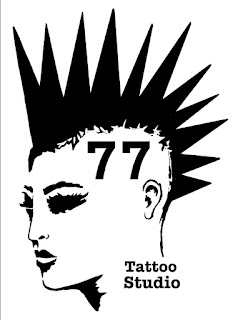
77 Tattoo Studio - LOGO
On my post "Punk's not Dead"- first ideas I briefly explained how I created the logo for 77 Tattoo Studio. I drew the punk girl head and I've tried different fonts.
The most iconic Punk Band Logos were created by either member of the band or their friend. The logos designs are simple with graphic black, white and red colours.
 |
| Mackie Osborne Social Distortion |
Mackie Osborne (wife of Buzz Osborne of the Melvins) created logo for Social Distortion which is a dancing, smocking skeleton holding a glass of wine. Since 1980, Osborne has created album artwork for many bands, including Circle Jerks, All, Tool, Tricky, Melvins, The Vandals and many more.
She used bold black and white colours and a bit of red to define wine and fire on the cigarette. I designed my logo for the "77 Tattoo Studio" in the very similar way, using same bold colours. I wanted the girl's lips to draw attention and number 77 as it is very important year for Punk subculture. This logo drew my attention because of the glass of wine, which looks like a Polish flag. It could be a perfect logo for the Polish Punk Band with a double meaning in it.
 |
| Brett Gurewitz, Crossbuster, 1980 |
Brett Gurewitz, the Bad Religion guitarist created this logo when he was only 18. And again, the logo is in bold graphic colours red, white and black.
“The name Bad Religion and the Crossbuster logo came to pass in the minds of two [teenagers] who were trying to find the most offensive name and image they could possibly find for the punk band they were starting in their garage… These are not people who thought that 21 years later they would be on the telephone doing interviews.” Brian Baker (2001)
Those Brian Baker's words are very related to me and my story. Most of my project design and ideas for "Punk's not Dead" I created when I was only 19, enjoying my Punk live in Poland. I would never thought that I will use them again, 20 years later as my university project in England!
Luckily my drawings survived all 12 removals, I kept them only because it was a big part of me.
Verbicide Magazine (2014) "The most iconic Punk Band Logos" Available from: https://www.verbicidemagazine.com/2014/04/15/best-great-punk-band-logos/ [Accesed on: 29.05.22]


.jpg)


The video works well as an example of process. I'd like to see you make links to the era you are focusing on. There is a link here to some of the most iconic Punk band logo's of the time: https://www.verbicidemagazine.com/2014/04/15/best-great-punk-band-logos/ Also, badges were and still are a big part of the scene: https://www.theguardian.com/culture/gallery/2016/dec/14/punk-pins-badges-1970s-music-patti-smith-clash
ReplyDelete